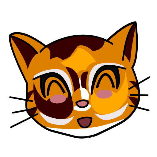
So I’ve decided to go for a new look for the site. The old one, if I’m being honest, was far too professional, and I didn’t want people to get the wrong idea. After a couple of abortive attempts (thanks for your input, friends), I’ve settled on the cartoonishly on-brand site you see here today. There’s a new art section, a little more on my day job, Ledger, and links in the Writing section to things like stories I’ve written and blog posts over at Into The Void. I hope you like it!
And I promise, I’ll try to actually update this thing from now on.


